Ironically, I’m creating this post from a 15” MBP with sRGB support. But consumers’ screens are supporting wider gamut, and that’s something we should add to our workflow.
In September 2015, Apple’s iMac was the first consumer computer with a built-in wide-gamut display, supporting the P3 colour space. Three years later all new iPhones - iPhone 7 included - and iPads support it. Also, Microsoft’s Surface Studio, Samsung Galaxy S8 and S9, and more modern devices and TVs are adding rich-colours to their offer.
In the same way that we took advantage of high-density screens using 1x, 2x, 3x … assets, we now have the opportunity of using a broader colour spectrum.
Bjango explained colour management in detail in these three posts: Part 1, part 2 and part 3.
If you go through the third part, you will see that some tools don’t support colour management. I guess this will change soon, but it gives us an idea of the current state of colour management.
As a whole, the industry is doing a pretty poor job of colour management for our tools. This has to change.
Our display is going to regulate the colour range that we visualise, so if you are thinking of updating your laptop or screen, it’s important to have this in mind.
How to approach colour in your project
I can’t speak from experience, so I’ll just share some research and concerns I have about using wide colour spaces.
Metrics
Maybe a good first step is understanding the impact of this decision during this transitioning time when not all devices are prepared to manage something else beyond sRGB. We could argue if people would appreciate this change, but if a significant percentage of your users have rich-colour devices, it might be worth this change.
Performance
Which screens are candidates for this change? Should it be a global change? Performance is particularly important and we must find the right balance. I haven’t found much information about iOS, but this is what Android says.
Workflow
Think about how this would affect you and your team. I guess that we will all jump into rich colour spaces using DCI-P3 or others very soon, but it’s more about when moving forward.

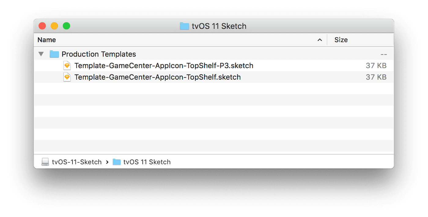
You can see how Apple uses sRGB for mobile assets in its latest design resources and provide both sRGB and DCI-P3 assets for TV.
If you are using Sketch, have a look at their documentation about colour management and make sure you know the implications of converting colours compared to assigning a colour profile.
Related links
- Apple - Human Interface Guidelines: Color
- Android - Enhance graphics with wide color content
- WWCD 2017 - Get Started with Display P3 (Video)
- Google I/O ‘17 - Understanding Color (Video)
- Improving Color on the Web
- Bringing Wide Color to Instagram
- Android Color Management: What Developers and Designers Need to Know
- Comparison between normal and wide-gamut images
- Wikipedia - DCI-P3